
Client
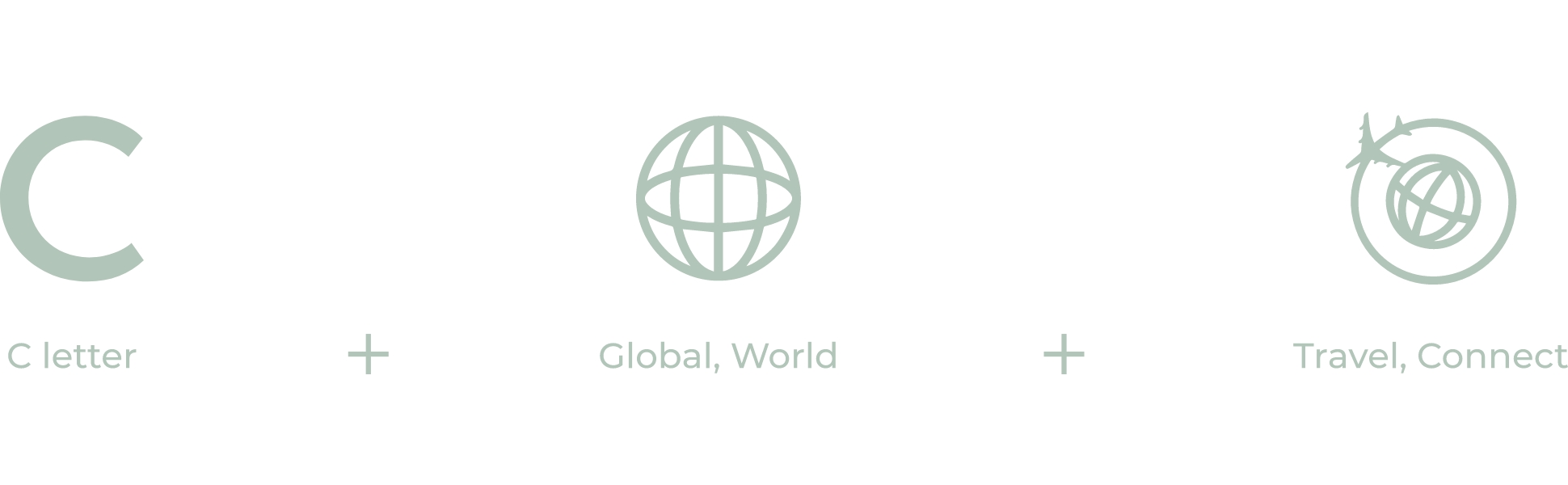
The core business idea of ‘Connect Vietnam’ is providing users access to discover and purchase a wide range of travel, local services, and financial services products. With that in mind, they developed a state-of-the-art, customer-centric solution to unleash the market potential for people who want to travel. The only thing they lacked was a fitting brand identity that would help them achieve their goals, and that’s where we came in.
Overview
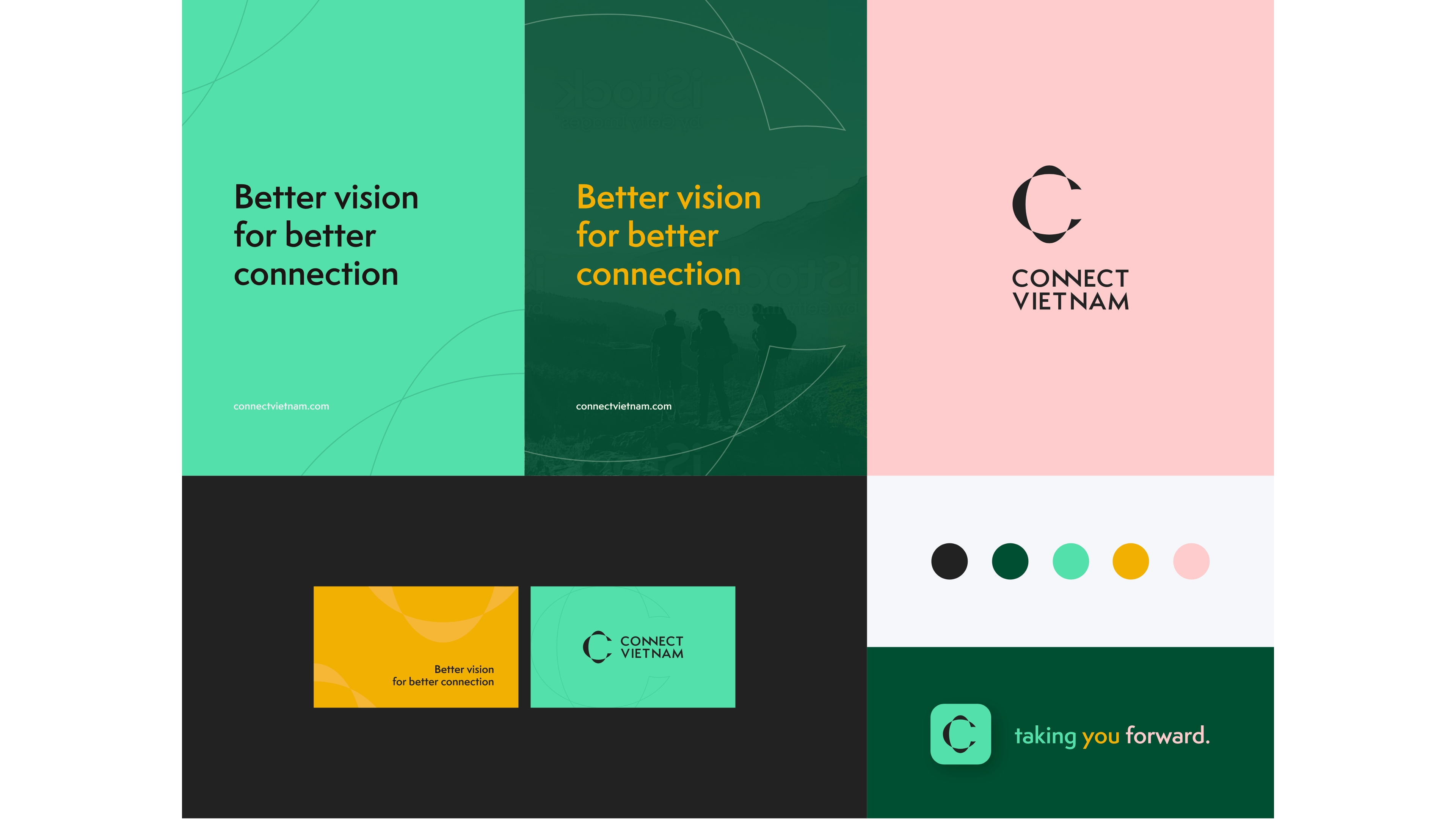
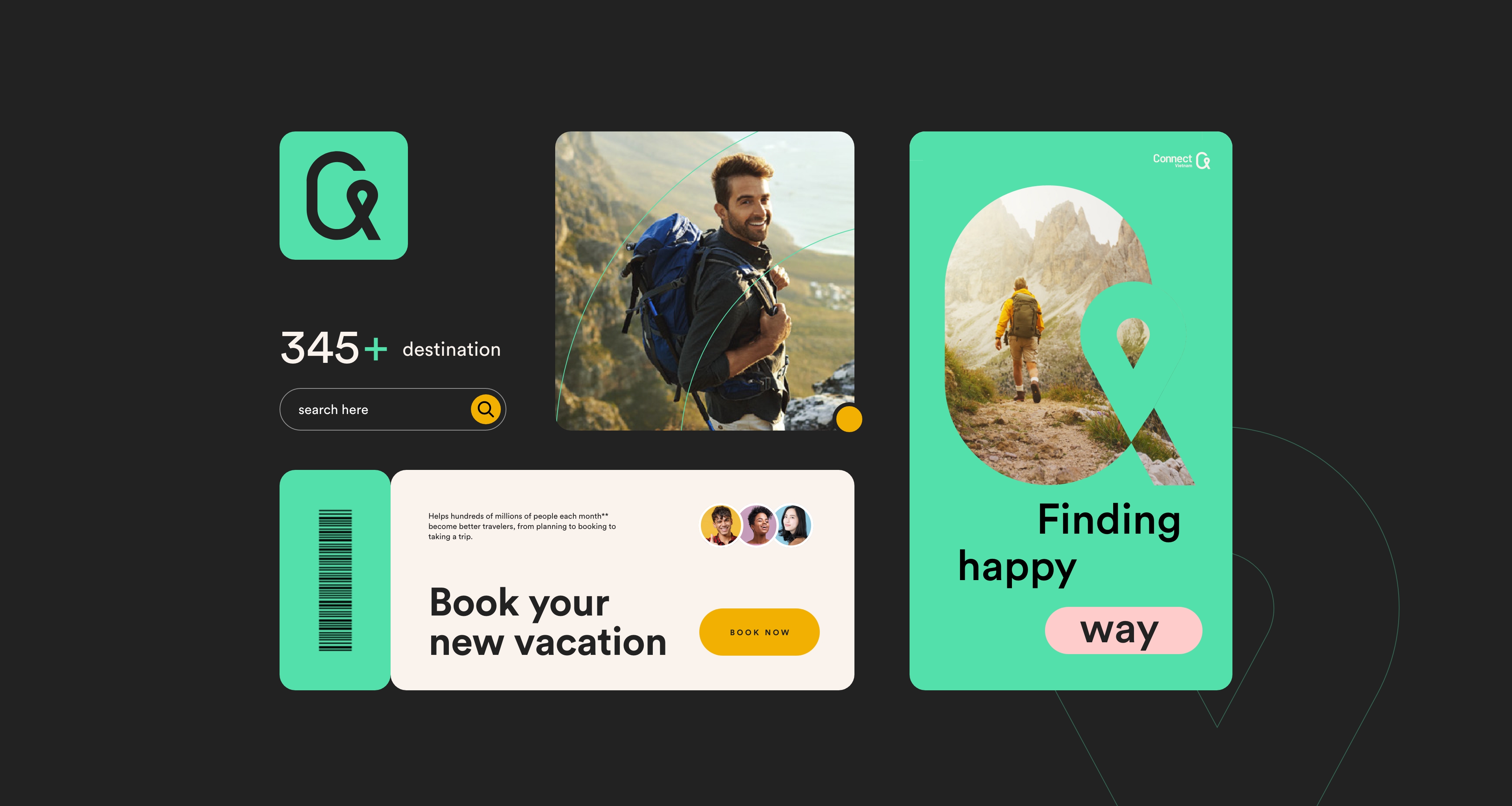
We researched, strategized, and designed the new ‘Connect Vietnam’ visual identity, supported by a spanking new design language that is consistent across all platforms.
Identity design
The branding design process began with extensive research into the current state of lifestyle and travel-tech in Southeast Asia, the sector’s existing web presence, the pain points of the target audience, and the touchpoints of the brand communication.
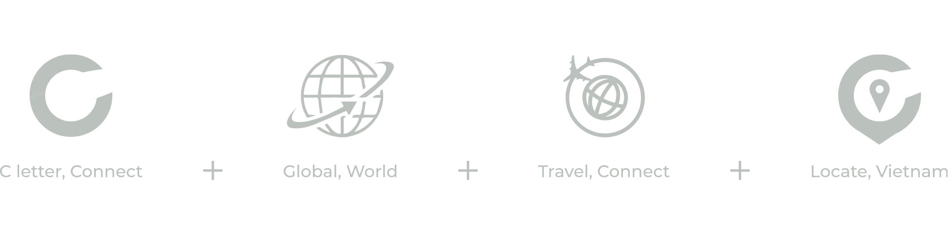
Based on everything mentioned above, the key advantages of the product that branding must convey are:
・Accuracy of real-time location
・Rich information
・Reliable
・Affordability
In addition, the team aimed to create a visual branding design system that could range from strict and business-like to illustrative and emotional.
As well, we aimed at making a visual branding design system.
One of the core tools supporting both emotionality and usability in brand design for ConnectVietnam is color. The palette uses bright shades of natural colors, utilizing color psychology and providing an instant visual connection to the topic of travel and nature.

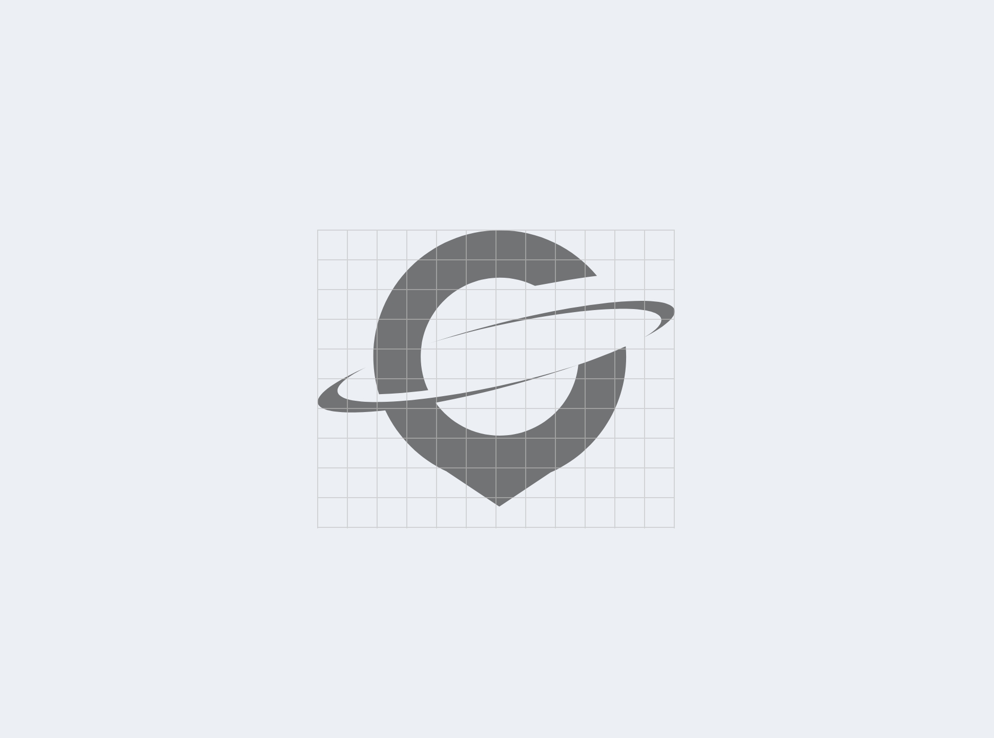
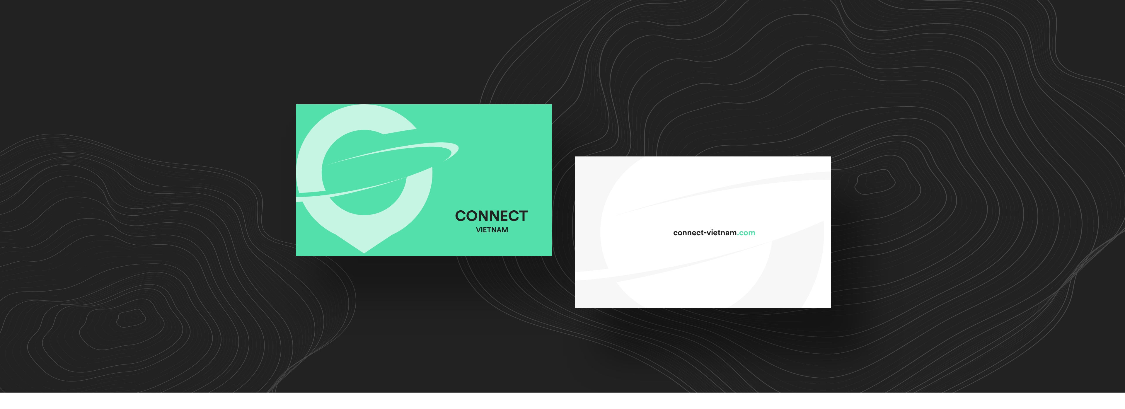
After deciding on colors, the team began work on the logo. The initial logo design approach was based on connection as the core of the product’s problem-solving power. Based on that, the creative search resulted in a set of brand sign options that reflected that idea through curves and circles forming abstract shapes and building association with the world visualization. The basic shape chosen for the brand symbol was a circle.
Here’s a glance at the logo design process.
The first version of the symbol developed in this direction was an abstract round sign consisting of 2 oval.
We needed a message that effectively communicates the oriented value of life-improving through travel around the world, especially in Southeast Asia. So, that means taking care of you to provide a service to help improve your life always by your side.
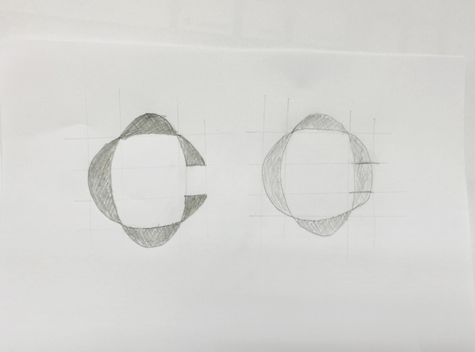
First sketches to think over the idea and find the composition
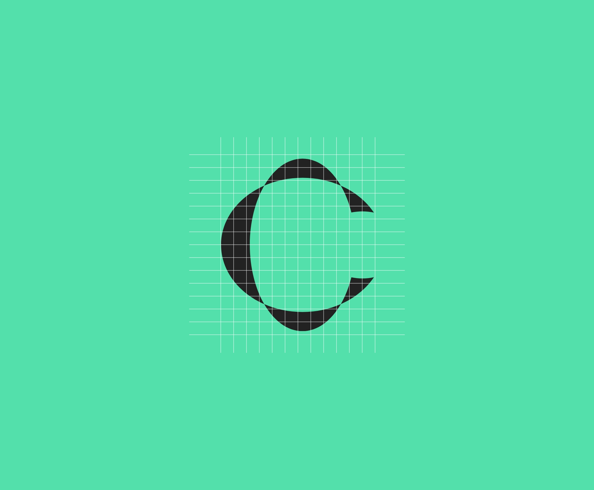
Digital symbol development
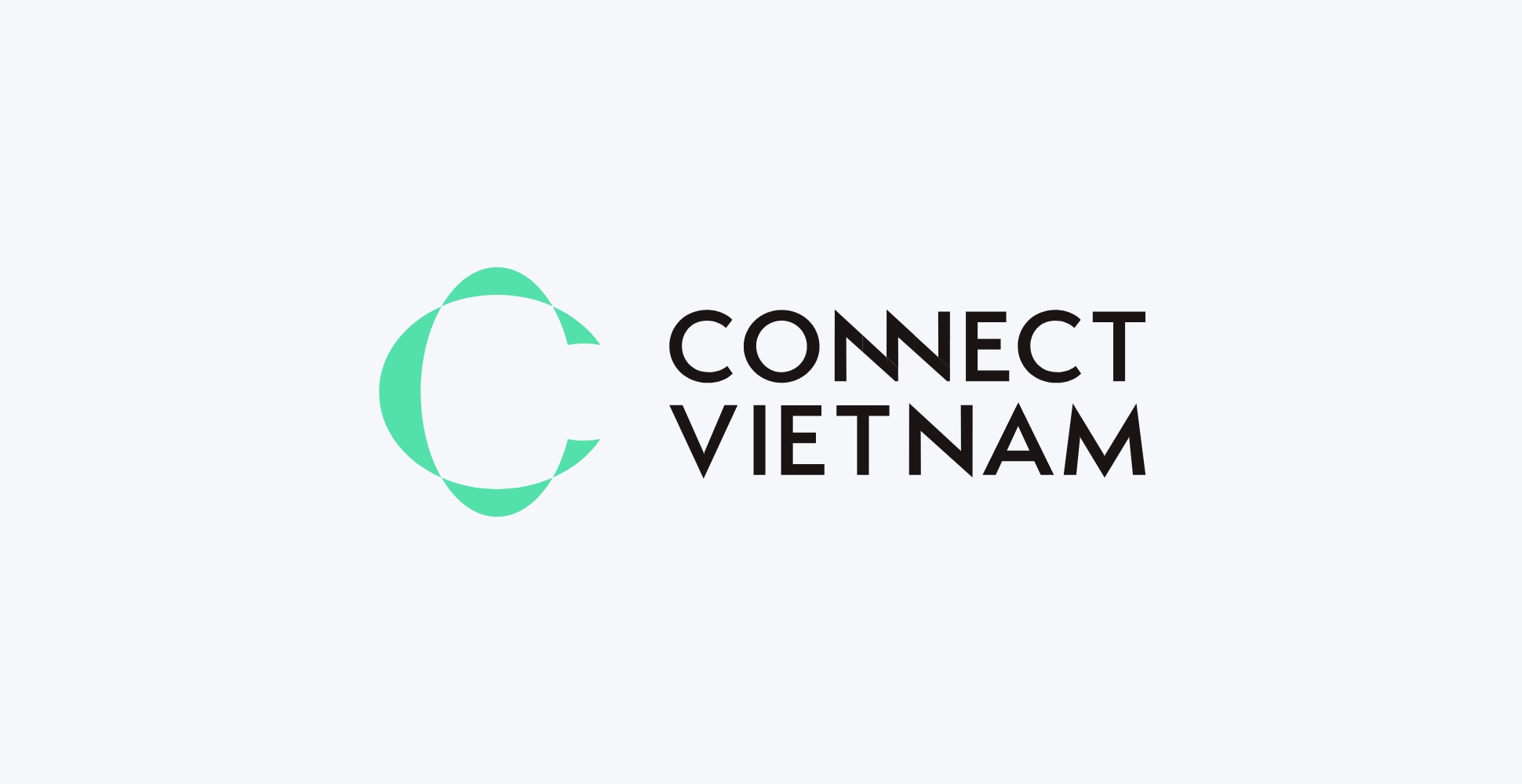
The symbol with brand name typographic part
And here’s elements designed to test how the symbol can be further developed into other types of graphics.
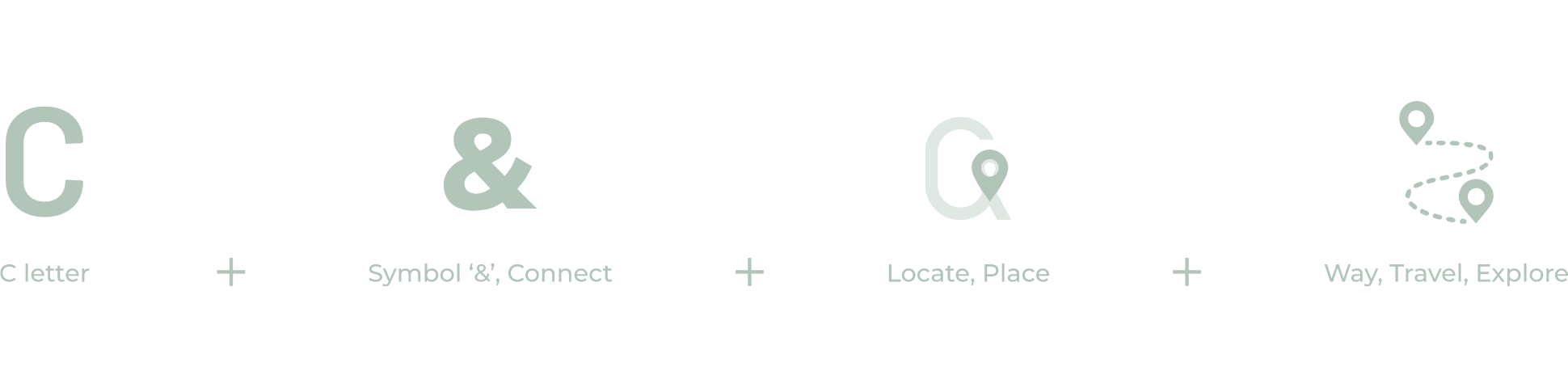
Another idea for the symbol at this stage of the creative search was to transfer the visual metaphor of the connection or the ‘and’, shaped by the symbol &, and a wide range of local attractions, shaped by the location’s symbol. The latter was taken into deeper consideration.
Digital symbol development
Testing the symbol with brand name typographic part
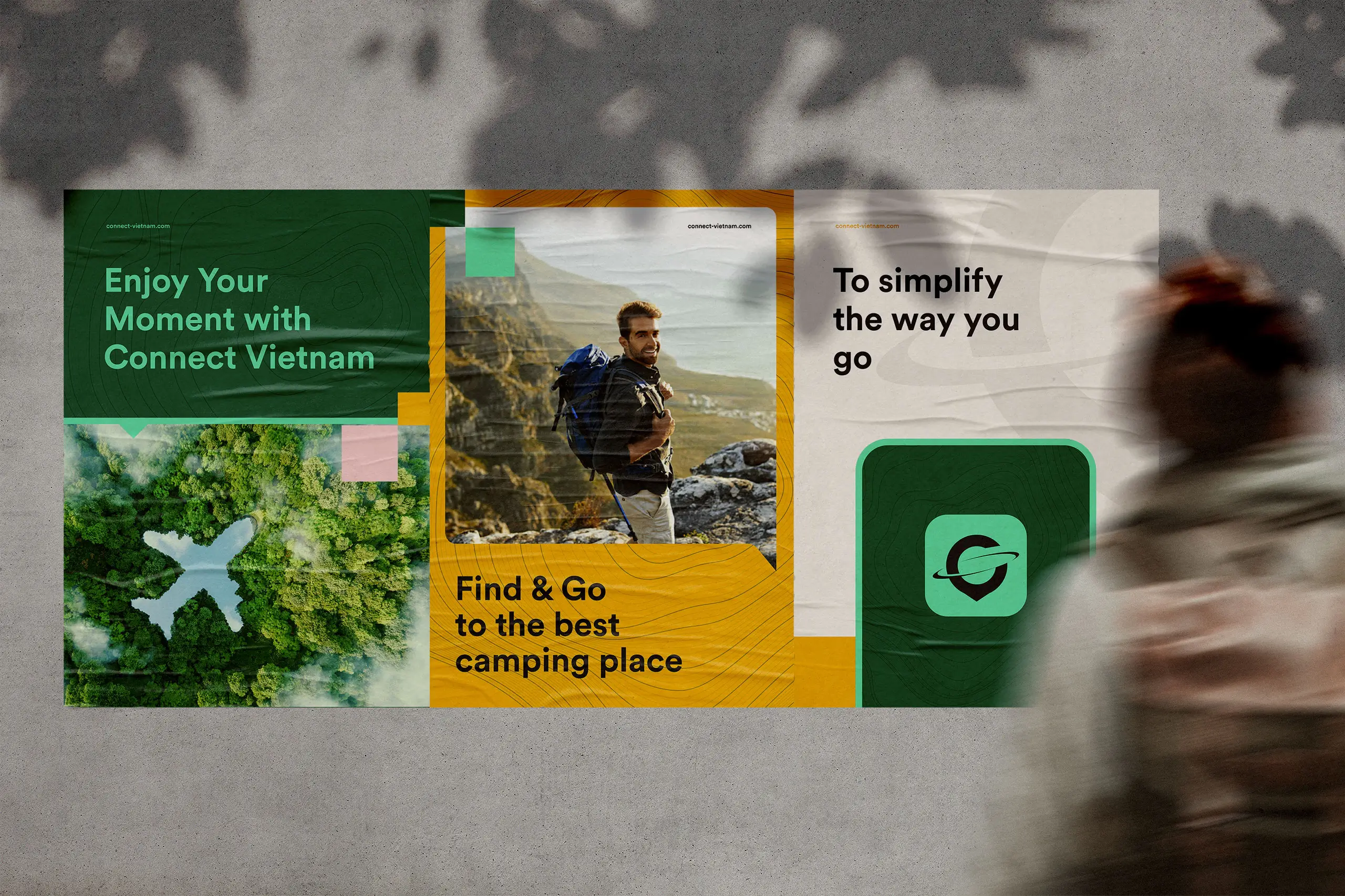
The set of branded items was also presented to show how this version of the logo and color palette could work for various marketing goals: banners, printed advertisements, social media posting, etc.
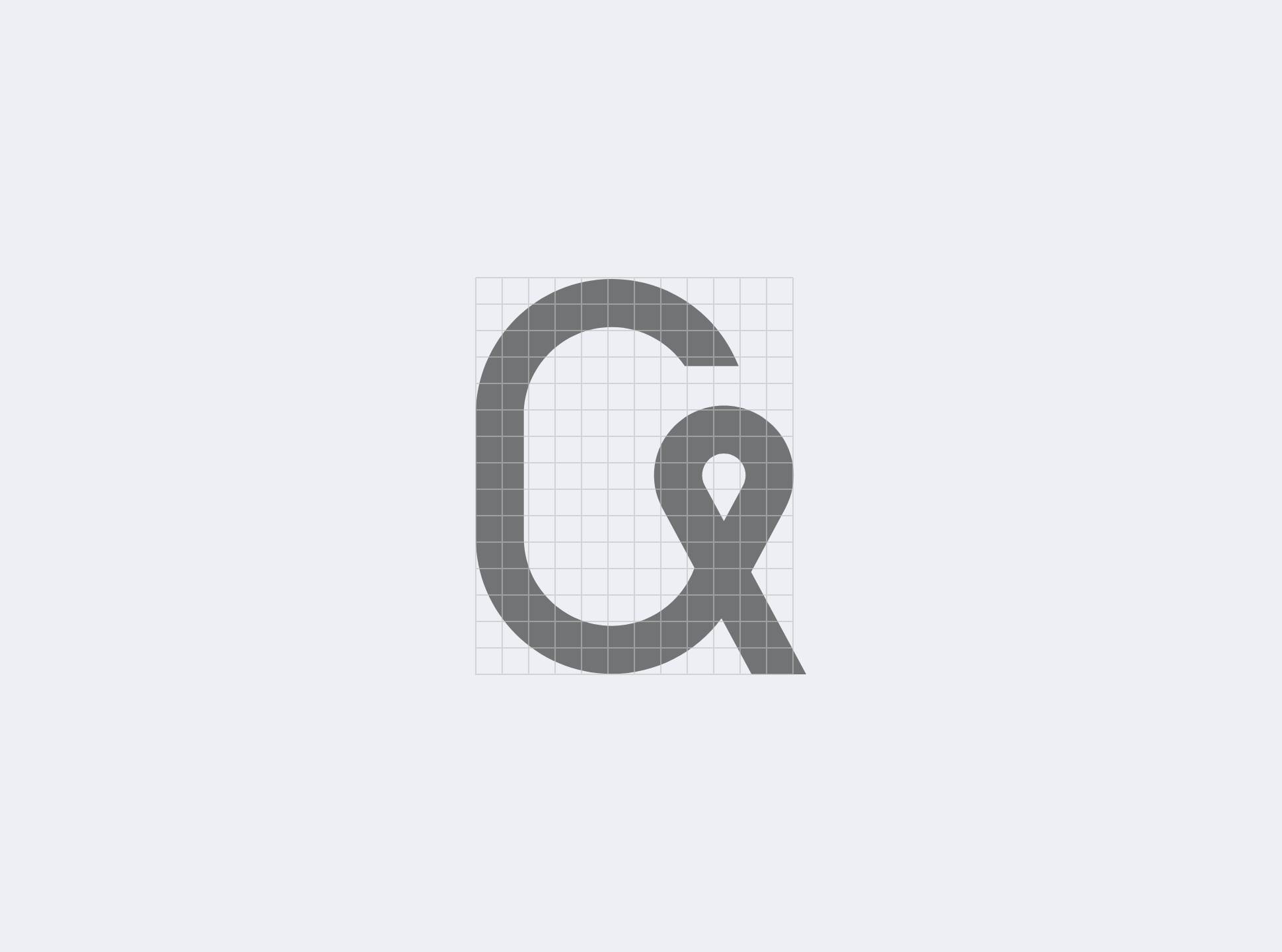
Although the general concept looked effective, we decided to move on to the next iteration after discussions with clients and additional testing. So, the first approach was also based on distant views of the earth, but this time the oval and the letter C were combined to cut each other in one direction.
On the other hand, the final version started at the intersection of the second version and the ideas considered in the first version. That means we have to think about the location’s symbol.
So, we considered the two elements: connection (the curve around the world), and local attractions.
The logo had to become simpler and less detailed to stay clear and informative in various sizes and get packed into a new color palette giving a quick connection to both user and their service.
Digital symbol development
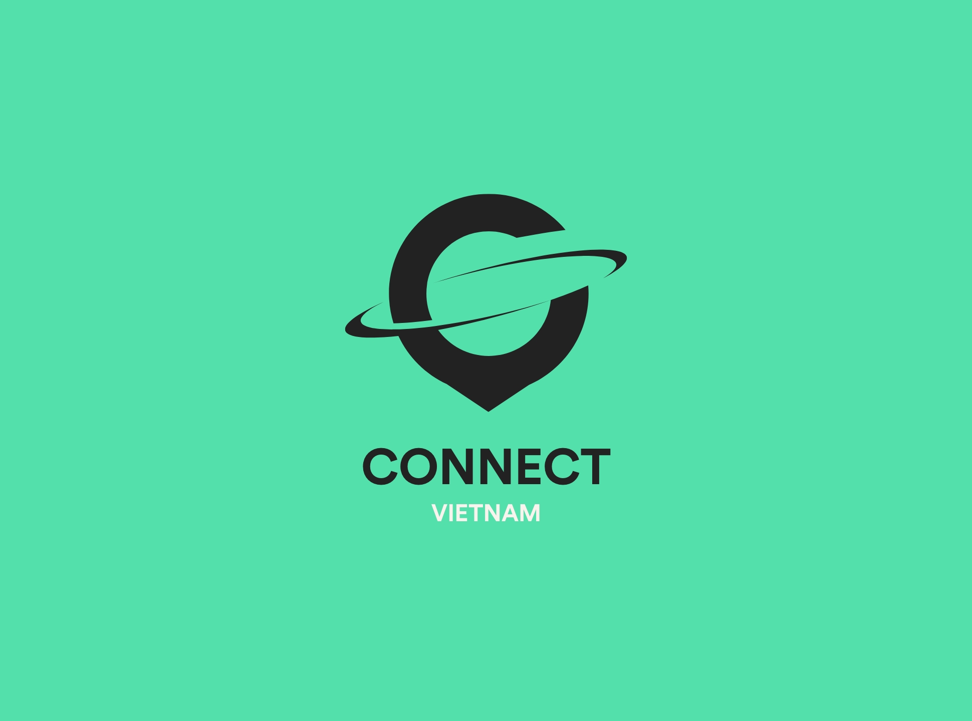
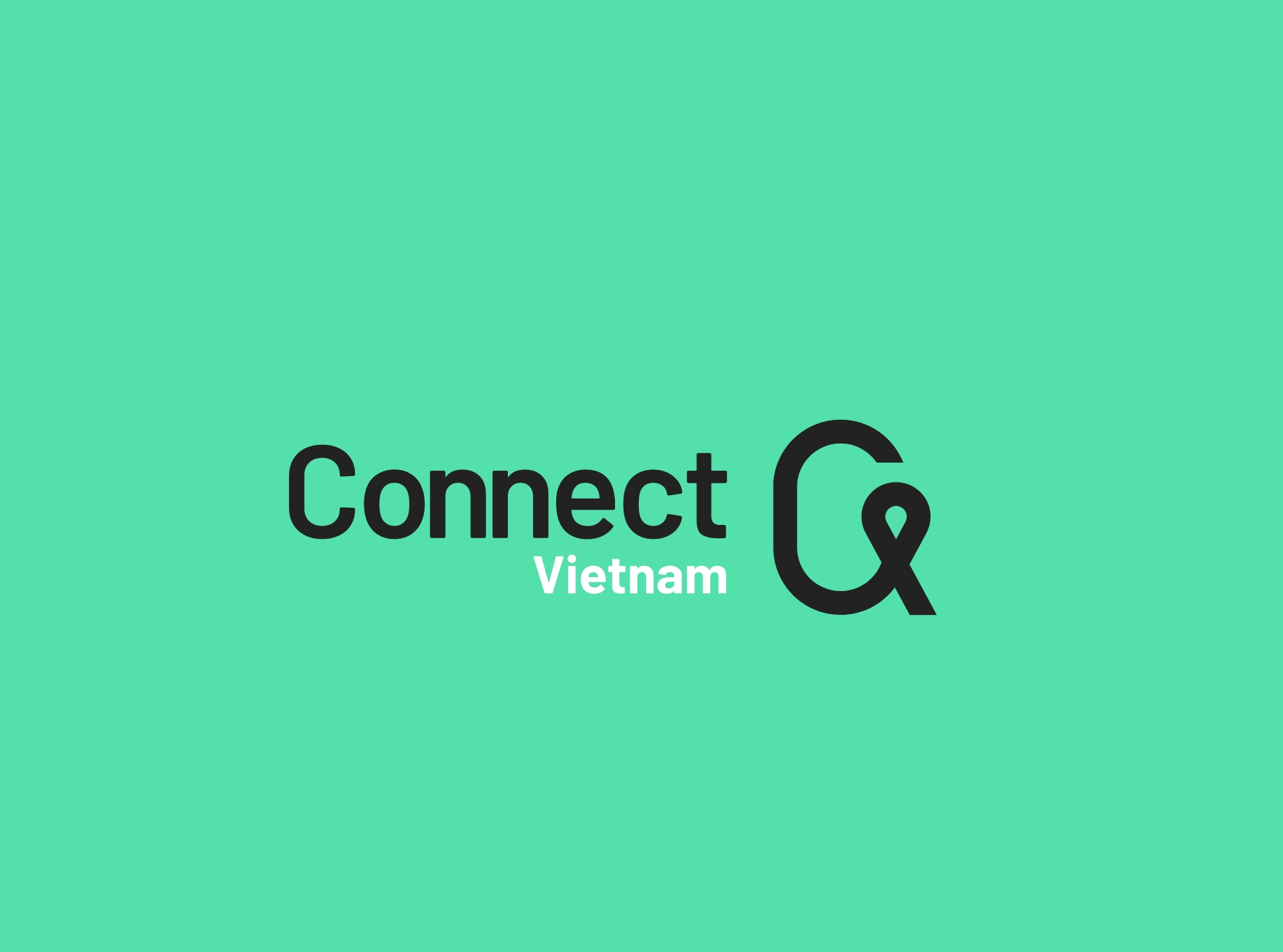
Testing the symbol with brand name typographic part
So, based on that solution, the consistent set of branded items was designed for various advertising and brand communication.
0
0 out of 5,0 stars
5 - 0 votes
4 - 0 votes
3 - 0 votes
2 - 0 votes
1 - 0 votes
Click to rate
0 Votes
Thanks for reading
We are ALIVE based in Vietnam
More from ALIVE

Enhancing Your Recruitment Website: The Key to Hiring Top Talent in Vietnam
In 2023, Vietnam's export industry was sluggish due to slowing demand from Europe, the U.S., and China, and there was a wave of restructuring among both local and foreign companies in the manufacturing and real estate sectors. On the other hand, it is a fact that we began to see articles and columns in the media reporting that the economy is gradually showing signs of recovery in 2024. In fact, Alive Vietnam has been receiving an increasing number of inquiries from companies wishing to market their products and services to the Vietnamese market.
Business
2024.4.3
![[2023] Guide to Vietnam’s Salary Trends and Strategies for Attracting Top Talent](https://alive-web.vn/wp/wp-content/uploads/2023/10/【2023年最新】ベトナム人の給与事情と優秀な人材確保のポイント解説-1024x536.jpg)
[2023] Guide to Vietnam’s Salary Trends and Strategies for Attracting Top Talent
Vietnam is expected to continue experiencing long-term economic growth. In recent years, the rising labor costs in Vietnam, coupled with the impact of the weak yen, have made "securing good talent at reasonable costs" one of the key challenges. Therefore, we have compiled various currently available data to provide an overview of "Vietnam's salary trends and what Japanese companies should do now to attract top talent."
Business
2024.4.3